Client
Self-initiated
year
2023
2023
DISCIPLINE
Type Design


Did the world need yet another sans serif? Probably not, but I did.
Project Description
Project Description
Project Description
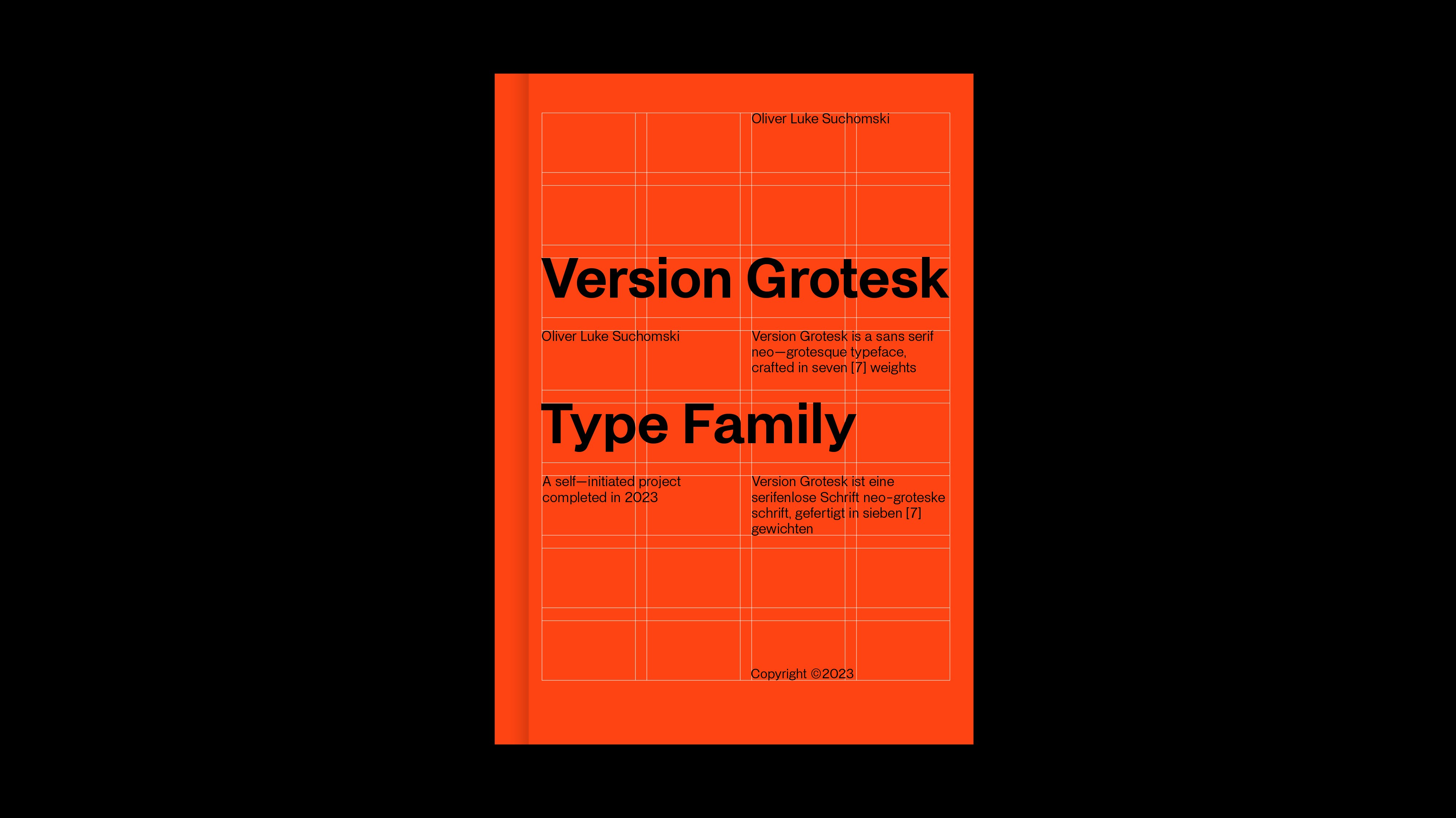
As a great admirer of the International Typographic Style and typography in general, it has been a personal goal to create a multi–weight sans serif type family, inspired by my influences, for some time; A homage to Helvetica Neue and Akzidenz Grotesk.
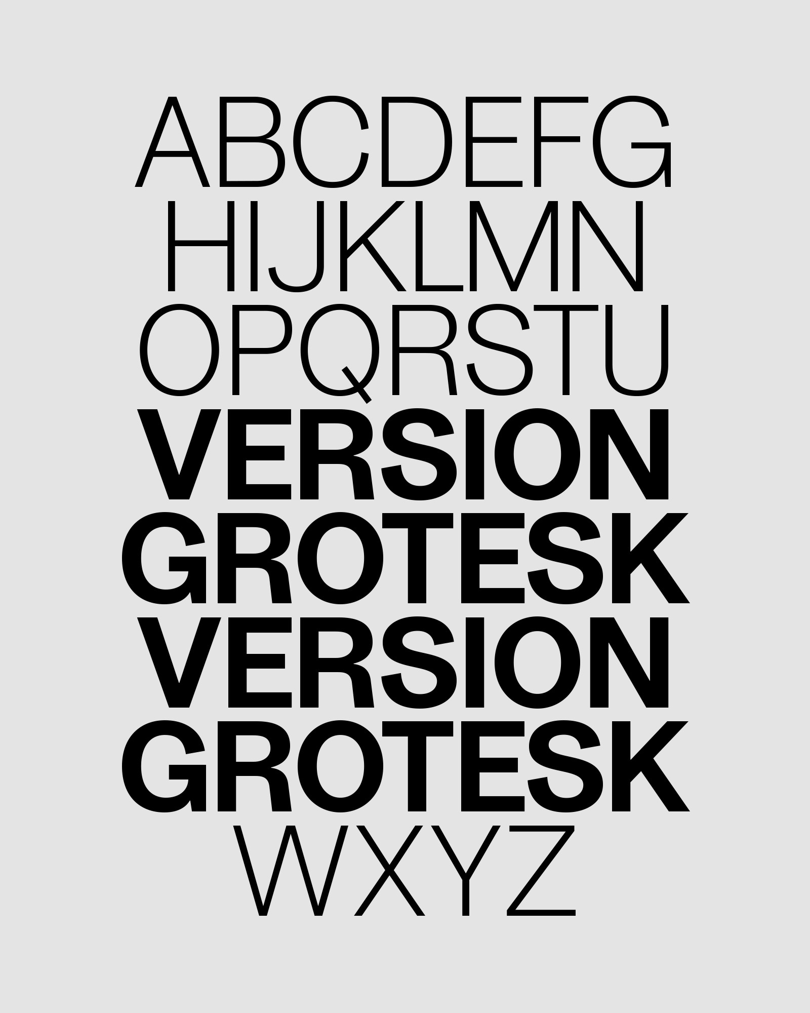
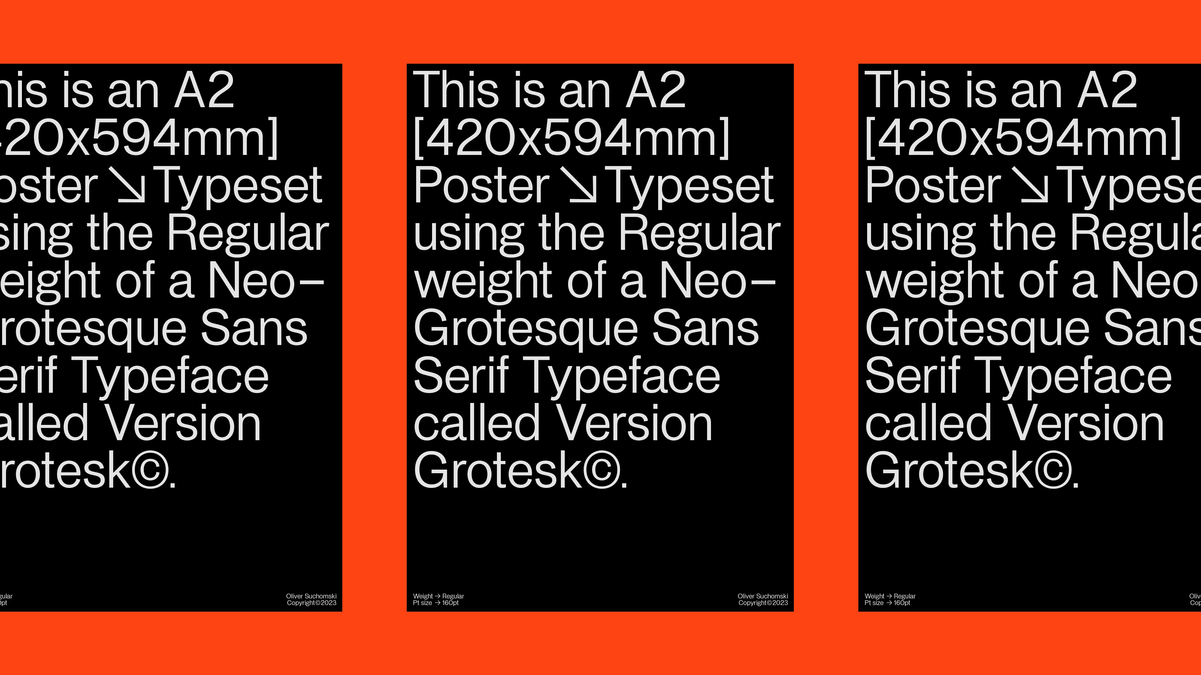
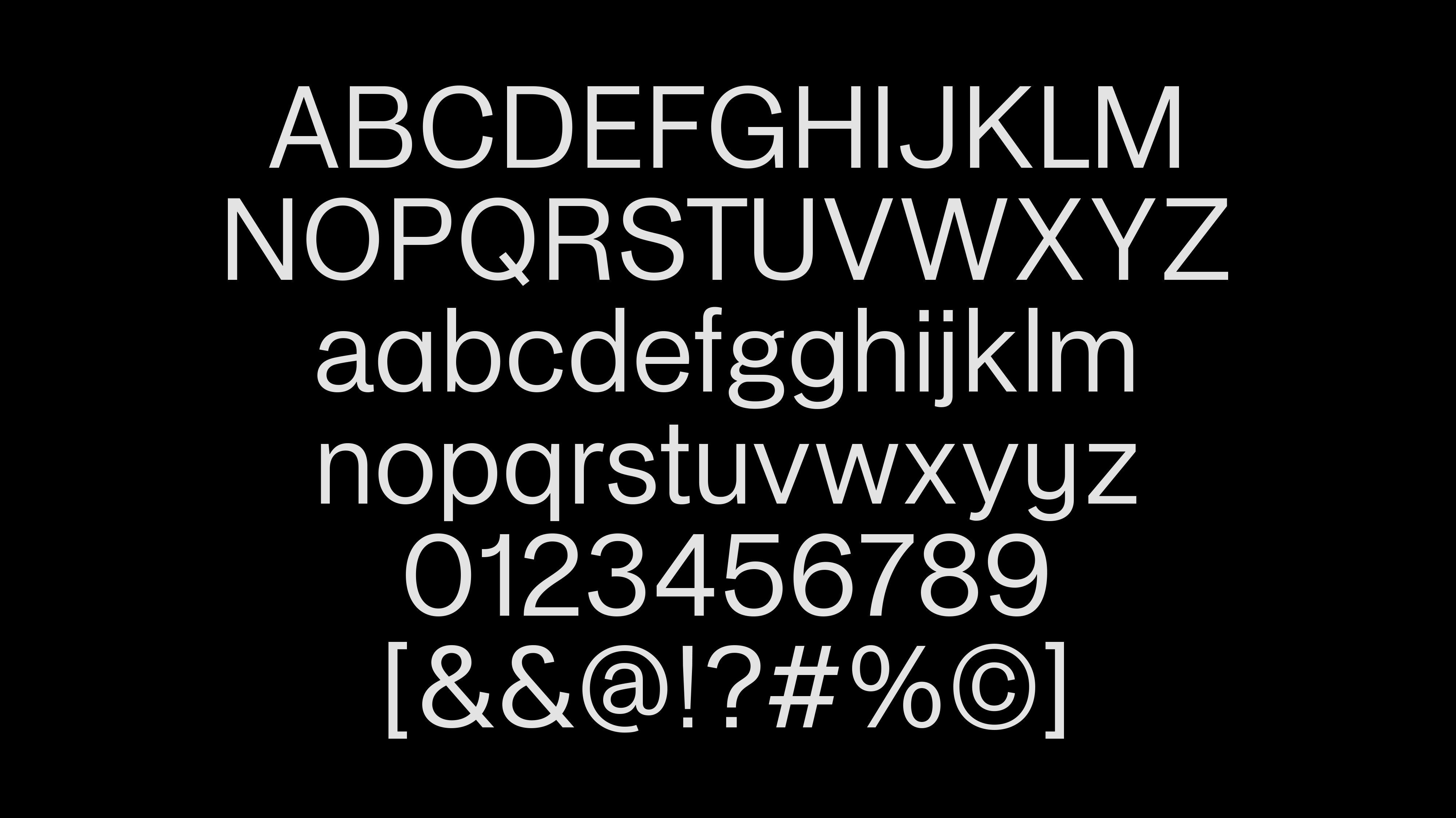
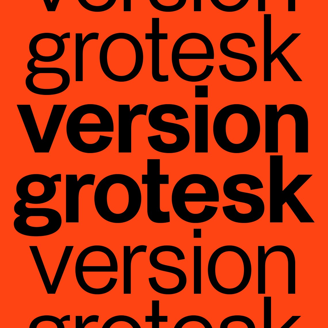
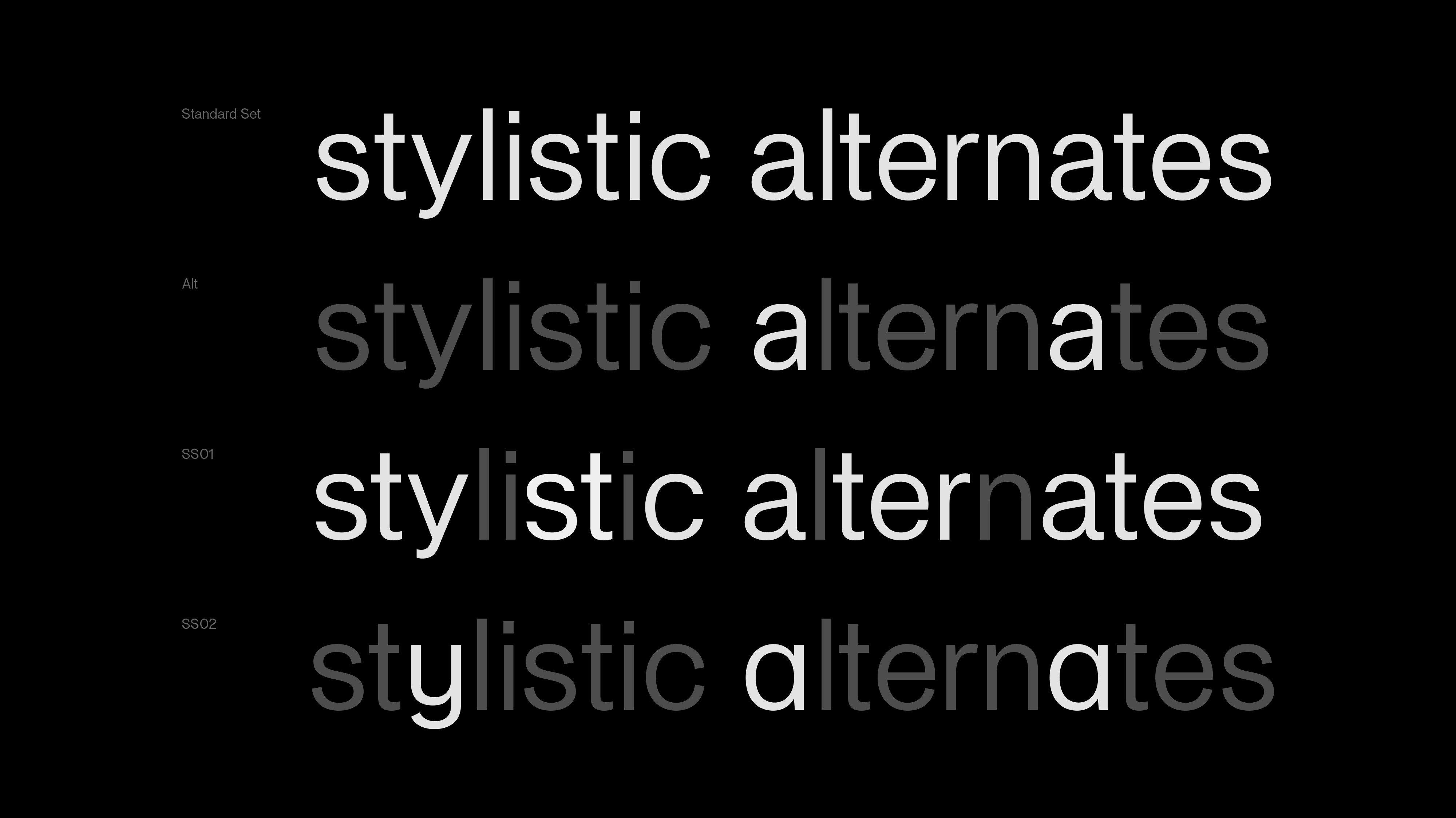
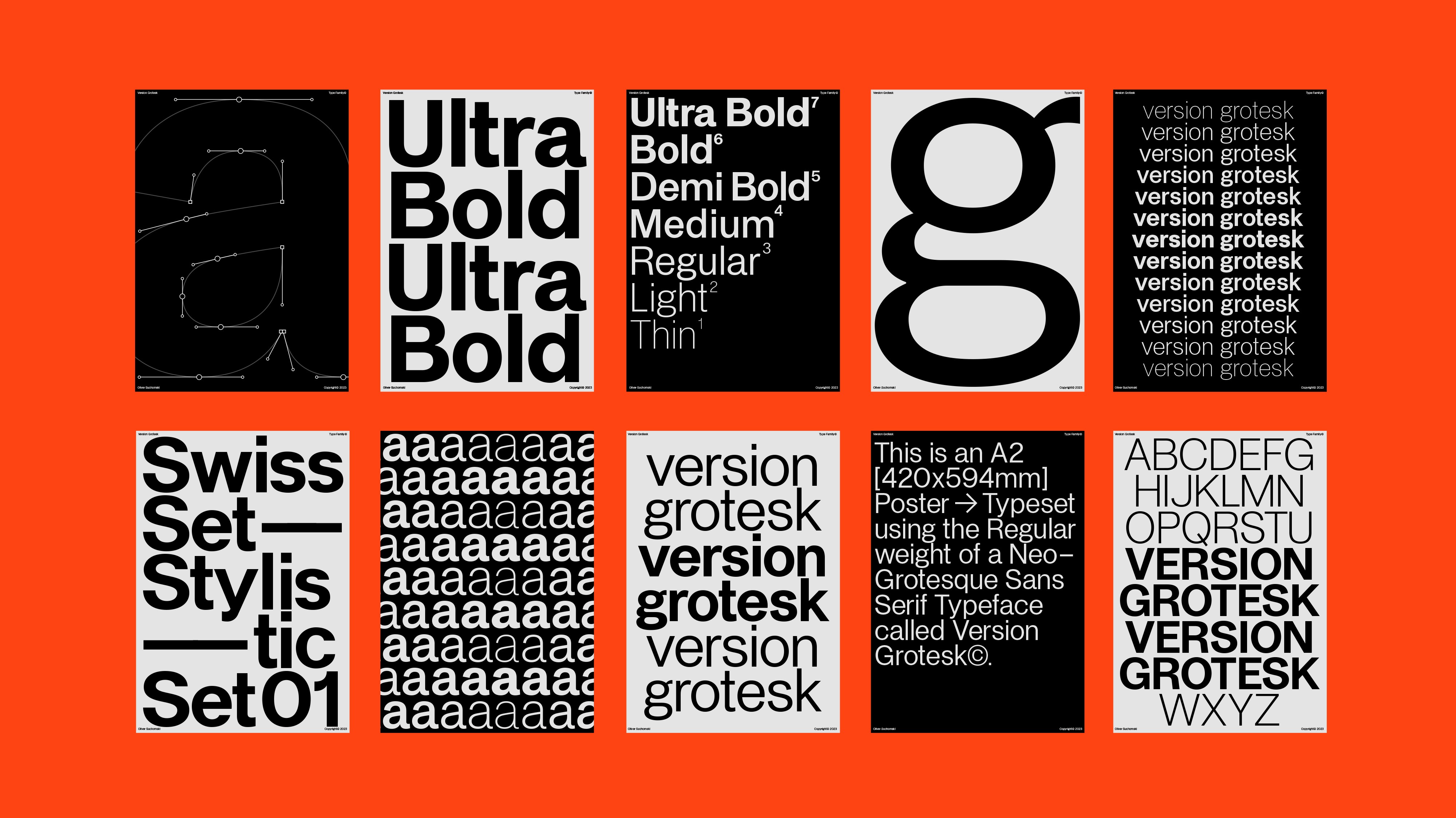
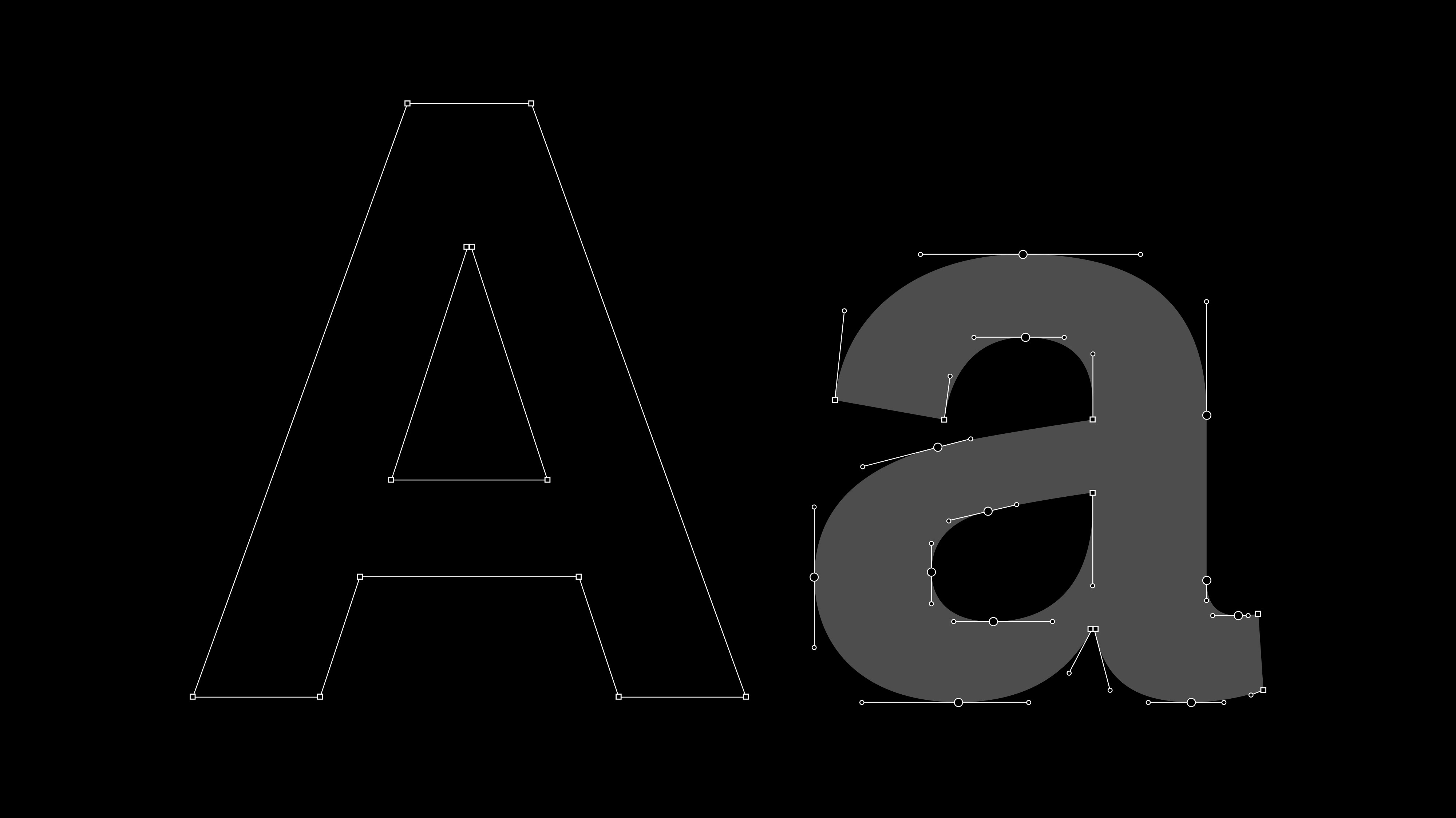
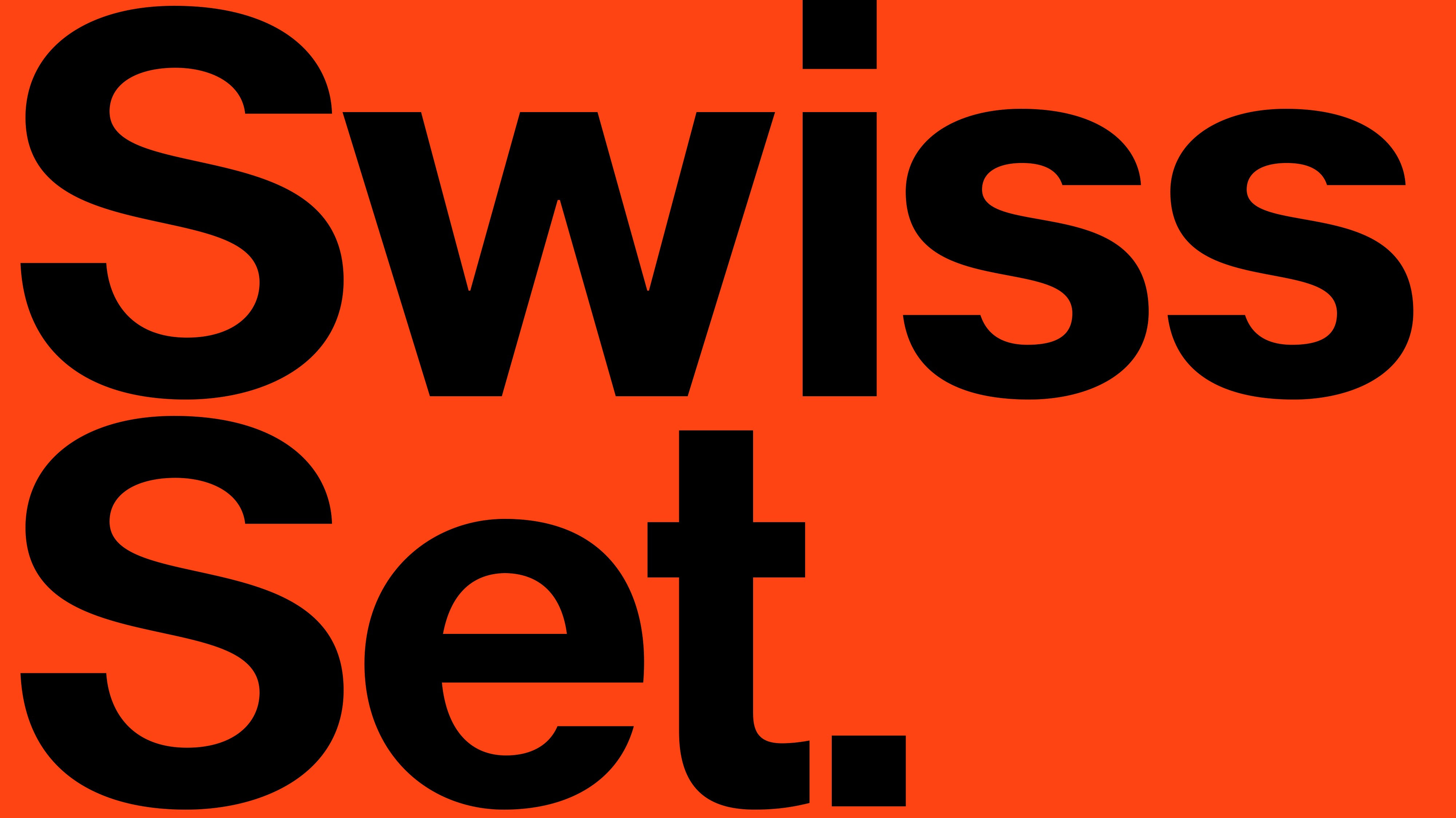
Version Grotesk is a neo-grotesque typeface inspired by classic 20th century sans serifs, with added flair due to its sharp, angled terminals and my personal interpretations on Latin letterforms.
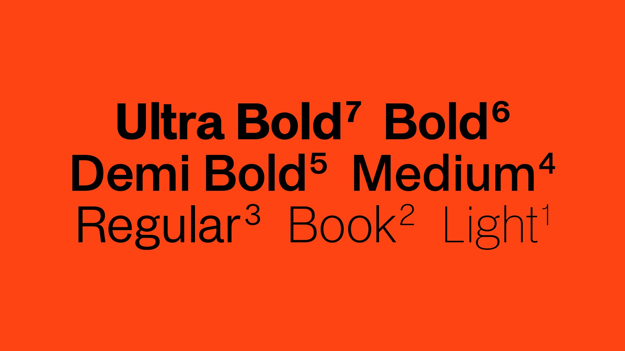
Crafted in 7 weights ranging from Light to Ultra Bold.
This self–initiated project was intended to stand as a marker for knowledge gained whilst conducting studies into professional type design and to track personal development within the field.
Responsibilities
Responsibilities
Responsibilities
— Typeface Design
— Typeface Design
— Typeface Design







Credits
Credits
Credits
Agency
Agency
Agency
Oliver Suchomski
Oliver Suchomski
Oliver Suchomski

